bored-charts
September 2024
pip install bored-chartsSee the code at github.com/oliverlambson/bored-charts.
Most data analysis and presentation tooling misses the mark.
I do a lot of data analysis, make a lot of charts, try come up with good conclusions, figure out what we should do now we know this, and then explain that to the people who can make that happen. I am so frustrated by how janky that workflow is. That sentence is literally the lifecycle of “doing useful analysis”, and all the tooling is so disjointed.
I’ve tried:
- slide decks with screenshots and bullet points (bad);
- google docs with the same screenshots and clearer explanations (better);
- dashboards with commentary blocks (wrong tool—dashboarding tools are for monitoring, they’re too restrictive for analysis1);
- people come over to my desk so I can explain things while clicking around some charts (pretty good, but transient);2
- threads in Slack with the same screenshots (pretty great: easy to consume, accessible, and information dense—there’s a reason twitter threads go viral). Not great for big decisions, more complicated stuff, or posterity.3
- writing commentary inside my Jupyter notebook (not great, scary code == doesn’t get read).
It seems that doing and presenting analysis are thought of as entirely separate workflows. I don’t agree with this. I want presentation to link directly to the code so I can work on it while my analysis evolves (writing a great way to force yourself to think). But: I want to present a clear argument, not a barrage of charts; and I don’t want to overwhelm my reader with a bunch of irrelevant code.
Evolves is a key word there. Analysis is iterative, and doesn’t just get shared at the “end”. (You’ll realise you need to cut a population out of the sample because those users go through a weird journey. Or you’ll be working on it while the data is still maturing.) Repeatedly copying and pasting charts into decks is tedious, which means you end up keeping your analysis in your head rather than on the page. This means you’re focusing less on the interpretation, which is bad—that’s the most important bit.
I’m not talking about doing exploratory data analysis here, do that however you like. But, once you know what you’re trying to do, you should be writing the code somewhat properly4. I’ve been a part of enough horror stories—where a monstrous Jupyter notebook contained all the logic of a piece of analysis—to know that trusting them implicitly is only tricking you into thinking you’re right, and it’s very painful when you (hopefully) realise you messed something up.
Do we really need another tool…
We could get most of the way there if we got good at Jupyter notebooks. Use nbconvert to export a nice PDF with hidden code input cells. Pair it with jupytext and you start to get somewhere pretty appealing5. But this is layering tools on tools, each of which isn’t really designed with the intention of doing what we’re trying to achieve. (In other words, it could work, but it’s a bit patchworky.)
…yes (it’ll be fun)6
In an ideal world, I want to write my commentary in plain text and easily link in my actual analysis code when I need to show something. I want the presentation to be an afterthought so I can focus on the content.
This doesn’t seem unreasonably complicated: I basically want markdown extended with a way to say “put that python chart here”, and I want it to render with something that exports nice PDFs.
The dream is, I can write a report like this:
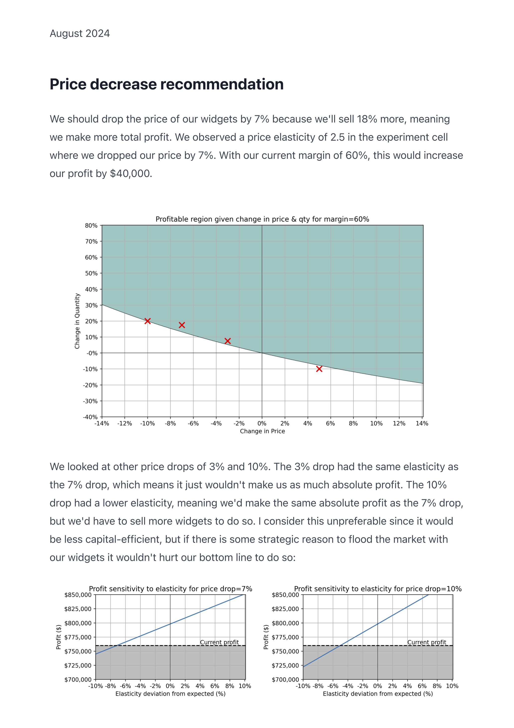
# Price decrease recommendation

I think we should drop the price of our widgets by 7% because we'll sell 18%
more, meaning we make more total profit. We observed a price elasticity of 2.5
in the experiment cell where we dropped our price by 7%. With our current margin
of 60%, this would increase our profit by ???.

{{ figure("price_vs_quantity", margin=0.6) }}

We looked at other price drops of 3% and 10%. The 3% drop had the same
elasticity as the 7% drop, which means it just wouldn't make us as much absolute
profit. The 10% drop had a lower elasticity, meaning we'd make the same absolute
profit as the 7% drop, but we'd have to sell more widgets to do so. I consider
this unpreferable since it would be less capital-efficient, but if there is some
strategic reason to flood the market with our widgets it wouldn't hurt our
bottom line to do so.

{{
  row(
    figure("profit_at_price_drop", drop=0.07),
    figure("profit_at_price_drop", drop=0.10),
  )
}}
that has access to my existing analysis charts:
@figures.chart("price_vs_quantity")
def price_vs_quantity(margin: float) -> mpl.Figure:
    """plot the profitable frontier of price vs quantity for a given margin"""

    # calculations
    ...
    P, Q = np.meshgrid(price_values, qty_values)
    RHS = -P * (1 / Q + 1)
    mask = np.where(Q >= 0, margin > RHS, margin < RHS)

    # normal plotting stuff
    fig, ax = plt.subplots(figsize=(10, 6))
    ax.contourf(P, Q, mask, levels=[0.5, 1], alpha=0.15)
    ax.contour(P, Q, mask, levels=[0], colors="black", linewidths=0.5)
    ax.set_title(f"Profitable region given change in price & qty for {margin=:.0%}")
    ax.set_xlabel("Change in Price")
    ax.set_ylabel("Change in Quantity")
    ...

    return fig

@figures.chart("profit_at_price_drop")
def profit_at_price_drop(drop: float) -> mpl.Figure:
    """sensitivity of profit to elasticity for a given price drop"""

    # same kind of thing
    ...

    return fig
and it spits out this:
How it’s made
For rendering, the browser seemed like a reasonable choice, and exporting a web page to PDF is pretty
decent now thanks to the print css media query. Converting markdown to HTML
isn’t hard, and we can write the css once and never look at it again.
To make that one-line Python decorator, we can turn them into FastAPI endpoints,
and do some clever bits with the response models and serialisers to
automatically convert the Python charts to HTML. Then our {{ figure(...) }}
templating macro just has to get the figure’s endpoint URL—when the page loads
we can call it and swap it in with HTMX.
How it’s used
I’ve turned this approach into an installable python package. It lets me work on analysis and write-ups simultaneously (which is better, imo). It doesn’t require a bunch of boilerplate, and I get away from screenshotting/copy/pasting all over the place. A minimal bored-charts app is literally just this:
main.py:
from pathlib import Path

import plotly.express as px
import plotly.graph_objects as go
from boredcharts import FigureRouter, boredcharts

figures = FigureRouter()


@figures.chart("population")
async def population(country: str) -> go.Figure:
    df = px.data.gapminder().query(f"country=='{country}'")
    fig = px.bar(df, x="year", y="pop")
    return fig


app = boredcharts(pages=Path(__file__).parent, figures=figures)
report.md:
## My report

USA's population has been growing linearly for the last 70 years:

{{ figure("population", country="United States") }}
Check out a full example here.
Postscript: why not use evidence.dev or one of those?
This was definitely inspired by projects like evidence.dev, observable framework, and rill.
I wrote
bored-chartsbecause: (1) I wanted to use python for data analysis and charting, (2) I didn’t want a static site, (3) I didn’t want to pay for proprietary deployment, and (4) it was fun.
Drag-and-drop chart building is really convenient, but the rest gets in the way. With gpt doing the boilerplate now, the friction of plotting in code is dropping.
I tried recording screencasts with voice overs to make it less transient, but that’s too annoying for people to consume.
If you’re trying to communicate a key point or make a decision quickly, just write a Slack thread.
I prefer to refactor as I go: once you’re happy with something you’ve found, pull it out into a function and replace the Jupyter cell(s) with a single import line. This forces you to figure out what you’re actually doing while you’re still doing it (instead of deciphering it after).
I would much rather use plain text (it’s just the best)—Jupyter notebooks are heavy, and they suck in version control (they’re huge JSON blobs with python and metadata and markdown and output),
Similar to pgmq, this solution is under 500 lines of Python and Jinja templates, it is easy to deploy, and easy to understand. You don’t need complicated stuff.